“His titles are not simply unimaginative ‘identification tags’-as in many films-rather, they are integral to the film as a whole. When his work comes up on the screen, the movie itself truly begins.”
—Martin Scorsese
“Saul Bass wasn’t just an artist who contributed to the first several minutes of some of the greatest movies in history; in my opinion his body of work qualifies him as one of the best film makers of this, or any other time.”
—Steven Spielberg
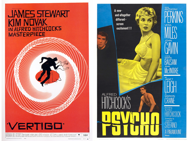
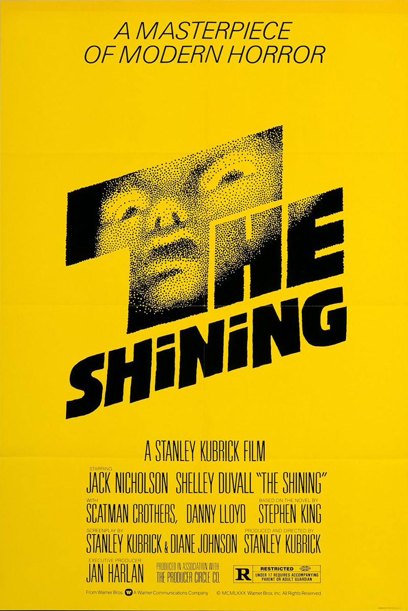
Every human being who has had exposure to mass media and advertising has seen the work of Saul Bass in one form or another, perhaps mostly unknowingly. I am quite sure who ever reads this blog post must have seen the logo of AT&T or Quaker Oats or Minolta on the internet or in print. If in case someone is passive towards logo designs and can’t seem to recollect the rough visual structures of the above mentioned ones, even then I am reasonably sure that anyone who reads this post must have seen cult classics like Alfred Hitchcock’s ‘Psycho’ and ‘Vertigo’ or Stanley Kubrick’s ‘Spartacus’ and ‘The Shining’.
If movies are not your thing and you haven’t seen any of the above mentioned ones… then I suppose you are perhaps reading the wrong blog!
All jokes apart, the point I am really trying to put forward is that Saul Bass is one of the most celebrated graphic designers of our time, even though he’s been dead for more than two decades his designs still live on ubiquitously in one form or another. We unsuspectingly see fragments of his design every day.

Design is thinking made Visual.
Saul Bass was born to Eastern European Jewish immigrant parents in 1920, Bronx, New York. He started working from the age of sixteen in trade advertising for films. During 1930s Saul Bass studied part-time at the Art Students League in Manhattan. He also attended Brooklyn College in 1944–45 with Hungarian emigrant artist and designer György Kepes.
Kepes had worked in Germany with compatriot and former Bauhaus teacher László Moholy-Nagy, and who headed the Light and Color Department at the New Bauhaus, Chicago (founded by Moholy-Nagy in 1937). Bauhaus, was an art school in Germany that combined crafts and the fine arts, and was famous for the approach to design that it publicized and taught. It operated from 1919 to 1933. The school was closed by its own leadership under pressure from the Nazi-led government which had claimed that it was a centre of communist intellectualism. Though the school was closed, the staff continued to spread its idealistic precepts as they left Germany and emigrated all over the world.
It was while studying with Kepes that Bass transformed from a young man interested in modern art, design, and film, to a full-fledged modernist in Bauhaus and European Modern Movement mode.
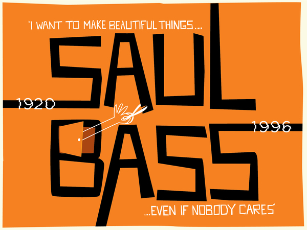
“I want to make beautiful things even if no one cares.”
– Saul Bass
Kepes’s belief that graphic design and motion pictures could play a major role in changing the world because they were less hidebound by tradition than other art forms resonated with Bass’s political views (then leftist, later liberal) and validated his chosen area of work. In the early 1950s, however, Bass began to distance himself from what he increasingly found to be overly rigid approaches to design and let other aspects—gut feelings, intuition, emotions, and humor as well as earlier and newer inspirations, from the bold reduction and flat color of the German Plakatstil (Plakatstil is the German for “poster style”, an early style of poster art that originated in Germany in the 1900s, the common characteristics of this style are bold eye-catching lettering with flat colors. Shapes and objects are simplified, and the composition focuses on a central object. They are also known as Sachplakat) of the early twentieth century to surrealism and experimental filmmaking—play greater roles in his work, and as a result he forged a more personal and distinctive style and approach to design.


He worked in New York as a freelance commercial artist for advertizing agencies and companies, including Warner Bros. In 1946 Saul Bass went to Los Angeles, where he continued to work as a commercial artist. By 1952 he had a practice of his own, which was registered from 1955 as Saul Bass & Associates.
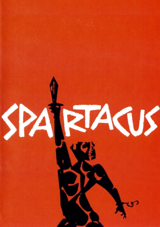
In 1954 he received his first commission from the director Otto Preminger to design the title sequence for his film “Carmen Jones”. The same year Saul Bass designed the title sequence for Preminger’s “The Man with the Golden Arm” and it caused a sensation. Saul Bass became the leading title designer in Hollywood; the directors Bass worked in this capacity include Alfred Hitchcock (“Vertigo”, “North by Northwest”, “Psycho”), from 1960 Stanley Kubrick (“Spartacus”, “The Shining”), from 1990 for Martin Scorsese (“Good Fellas”, “Cape Fear”, “The Age of Innocence”, “Casino”); and, in 1993 Steven Spielberg: the title sequence for “Schindler’s List”.
Between 1991 and 1996 Saul Bass also designed the posters for the Oscar Awards ceremony. In addition to his work for Hollywood, Saul Bass has created the corporate image of numerous companies, including United Airlines, AT&T, Minolta, Esso, BP, and Continental Airlines, for which he also designed the company logos.

Bass expanded the boundaries of graphic design to include film title sequences, and his highly evocative, and often impossibly compressed, images of intense clarity and subtle ambiguities transformed not only how titles were seen but also how they were conceptualized and regarded. Here was modern design on the cinema screen. Between 1954 and 1980 Bass was responsible for forty-one title sequences and several advertising campaigns for a wide variety of films in a wide variety of genres.
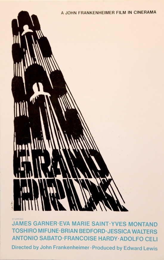
His most notable sequences, apart from those for Hitchcock, include The Man with the Golden Arm (1955), Bonjour Tristesse (1958), Anatomy of Murder (1959), and Exodus (1960), all for Otto Preminger; Walk on the Wild Side (1961) for Edward Dmytryk; Seconds (1966) and Grand Prix (1966) for John Frankenheimer; and the credit epilogues for Around the World in Eighty Days (1956, Michael Anderson) and West Side Story (1961, Robert Wise and Jerome Robbins). From Spartacus (1960, Stanley Kubrick and Anthony Mann) on, most of the title sequences were created in collaboration with his wife and former assistant, Elaine, including three tour-de-force openings for Cape Fear (1991), The Age of Innocence (1993), and Casino (1995), all directed by Martin Scorsese.
Between 1960 and 1966, five directors or producers asked Bass to undertake work on a film in addition to titles and advertising, work in which he was called upon to function variously as production designer, art director, choreographer, assistant director, and second unit photographer. The specific tasks ranged from scouting locations, to visualizing and storyboarding sequences within the movies themselves— the racing sequences in Grand Prix, the shower sequence in Psycho, the battle scene in Spartacus etc. When Bass designed and storyboarded battle scenes for Spartacus, for example, he functioned as a production designer, art director, choreographer, and assistant director rolled into one. When he conceptualized and made preliminary sketches of the gladiatorial school for the same film he functioned more as a production designer. Indeed, his work on that occasion was handed over to production designer Alexander Golitzen for development and realization. Golitzen was concerned that his credit be distinguished from that of Bass, as was Boris Leven, production designer for West Side Story. Psycho production designers (their official credit was art directors) Robert Clatworthy and Joseph Hurley seem to have had no such concerns. Clatworthy recalled thinking that giving the storyboarding of the shower scene to Bass was a “good idea,” stating that “Saul wouldn’t fall into the cliché as we might readily do.” Although what Bass did came to be referred to as visual consultancy, there was then no established industry term for this type of work. Hitchcock preferred “pictorial consultant,” while Stanley Kubrick favored “visual consultant,” a term Bass came to prefer.
Bass also served as visual consultant on five feature films – Spartacus (1960) , Psycho (1960) , West Side Story (1961) , Grand Prix (1966) and Not with My Wife You Don’t (1966) where he created sequences within the films as well as the titles.
In 1973 Bass directed the sci-fi feature Phase IV-a story about oversized, world-conquering ants. In all, Bass’s list of credits includes over 60 films. Saul Bass also began collaborating on film projects with his wife and partner, Elaine. They began making their own short films, and, in 1969, they won an Oscar for Why Man Creates, a combination of live action and animation which takes a philosophical look into man’s creative impulse. Bass and his wife continued to make award-winning short films for the inter- national festival circuit until his death at age 75.
Bass also created commercials, sponsor tags, and show openers for television and designed a wide range of advertisements, as well as packaging, retail displays, album covers, book covers, sculpture, lettering, typefaces, ceramic tiles, toys, exhibitions, and a postage stamp.
Many of the more than eighty logos and identity programs he created are still in use today; his major programs include Lawry’s (1959–96), Alcoa (1961), Celanese (1965), Continental Airlines (1965– 67), Bell Telephone (1968–81), Quaker Oats (1969), United Airlines (1973), Girl Scouts of America (1978), Minolta (1981), AT&T (1981–96), the J. Paul Getty Museum (1981), and The Getty (1993–96).12 The enormous circulation of his designs, through logos and screenings and the constant reworking of all manner of Bass images by younger designers, ensures that his work, including that undertaken in collaboration with Elaine, continues to impact many of us daily. The opening sequence for the AMC television series Mad Men, which mixes imagery from North by Northwest (the skyscraper) and the spiraling, falling man (Vertigo and Casino), is among the current homages to Bass.
The “Catch me if you can” (2002) opening title is a tribute to Saul Bass.
One marked characteristic of the Bass title is that its images undergo a journey whereby they are transformed into the unexpected.
In the opening to Hitchcock’s North by Northwest, bars of text ascend and descend, mimicking elevators in motion; white lines invade the screen, simulating the grid pattern in the skyscraper that dominates the opening shot. Another of Bass’s famed transformations is the eyeball that swirls into the vortex at the opening of Vertigo.
When Saul Bass began to do titles those were the dark ages for the designers, they lived in caves and were not considered important by the industry. Saul Bass went through a very intense learning experience with some extraordinary film-makers. From the Wylers, the Wilders, the Hitchcocks, and the Premingers.
According to Saul Bass, a title could set mood and prime the underlying core of the film’s story; to express the story in some metaphorical way. The title was a way of conditioning the audience, so that when the film actually began, viewers would already have an emotional resonance with it. Saul Bass felt that films really began on the first frame. This was, of course, back when titles were strictly typography, mostly bad typography. In U.S. films of the early to mid-1950s, the majority of what then were often called title backgrounds consisted of a fairly short list of credits, often in unimaginative lettering, rolling over a static image that suggested the genre of the film: for example, an image of a cowboy for a Western, a book for a literary adaptation, or a rolled parchment for a film set in medieval times. The status of the opening credits was so low that in many cinemas they ran as the under curtain was raised, while audiences chatted were settling in, going to restrooms, or involved in chitchat. Bass felt that this was a period that could work for the film. Otto Preminger agreed with Saul Bass and they took a shot at it with the opening sequence of The Man with the Golden Arm. Bass’s challenge was to create a symbol that captured the drama and intensity of the film without resorting to sensationalism. The result was a compelling image of a distorted, disjointed “arm,” the semiabstract form of which helped distance the image from the harsh realities of shooting up drugs, although they are implicit in the disfiguration. As well as being disembodied, the black “arm” has the appearance of being petrified and transformed into something else, just as the Frank Sinatra character in the film is transformed by his addiction. The reductive metaphorical symbol was featured in a comprehensive advertising campaign notable for its scope and uniformity as well as for the fact that images of the stars were either excluded or minimized.
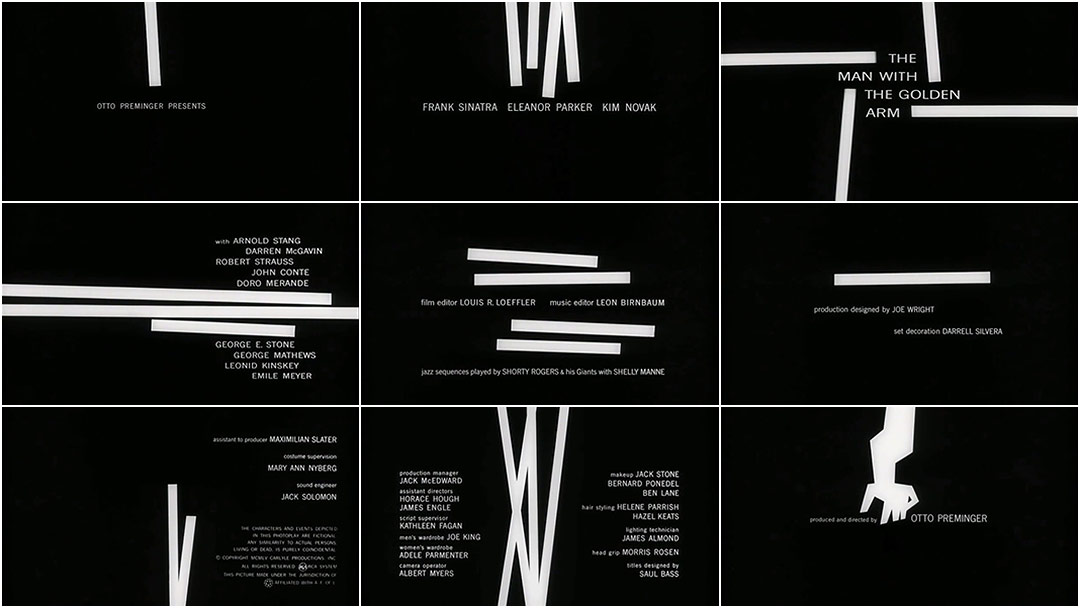
The symbol for the film turned out to be about as difficult to accept as the film itself. It also broke from the general point of view about how films were sold. The notion that a single visual element, good, bad, or indifferent, could become a statement for a film was not a notion that existed before ‘The Man with the Golden Arm’. Before that period, almost all film ads, used a potpourri approach. Advertisers threw everything into the pot, using the theory that, as a filmgoer, you would find something in the ad that would inspire you to see the film. If you didn’t like one image, you’d like another. Large amounts of money were at stake if a film bombed, and, because film ad posters were then considered the main means of selling a film to the public, the film studios were reluctant to chance using adventurous modes of expression or, indeed, any that differed from the norm. Conventions favored posters in which several aspects of the film were represented at the same time, often in a highly illustrative manner and sometimes in a sensationalist one. The idea of having a film expressed within the framework of one single, reductive statement was a very daring notion in the 50s. It was a particularly scary notion for distributors and film- makers alike. Making one statement that would be sufficiently provocative and true to the film, and that would sell the film was never thought of before. It was to Otto’s credit, that he didn’t flinch when this occurred and allowed Saul Bass to go through with the design and the rest is history. Set against a black background and accompanied by Elmer Bernstein’s driving jazzlike score, with its disjointed sounds expressive of anguish and torment, the sequence features white bars that appear, disappear, and form abstract patterns before finally uniting into the symbol of the “arm.” Contrasts between the black and white heighten the deafening intensity, and the disjunctures encapsulate the mood of the main character, a downbeat drummer with an inclination for gambling and drugs.
Bass on Title Sequences:
Bass believed that films, like symphonies, deserved mood-setting overtures and used ambiguity, layering, dissolves, and texture as well as startlingly reductive imagery, animation, and live action—sometimes using both animation and live action in the same title sequence—to shape how people experienced the time before a film began. Bass also encouraged audiences to see things in hitherto unconsidered ways in order to heighten awareness, create ambiguities, or raise expectations that something unusual was about to happen. In Vertigo, we experience the human eye as never before. As well as using titles to symbolize and summarize the film and to establish mood, Bass began to integrate his titles into the narrative process. He used the term “time before” for prologues dealing with the time before a film began. It could be years, as in those between the two world wars (The Victors, 1963, directed by Carl Foreman) or the minutes before the start of a Formula One race (Grand Prix, 1966, directed by John Frankenheimer).
Saul Bass and the Case of the iconic shower scene in Psycho:
Bass’s contribution to what is arguably the most famous scene in U.S. cinema—the shower scene in Psycho has been under serious discussion. Bass’s contribution to the shower scene—a fascinating collaboration, from novel and script to musical score—remains problematic, not least because issues of authorship are far from dead in many academic disciplines, design history and film studies included.
Bass’s contribution to the scene was substantial, it was ignored for many years by auteurist commentators who took their cue from Hitchcock’s evasive reply to a question regarding Bass’s contribution to Psycho above and beyond the title sequence for which Bass had a separate credit (his main credit was for “pictorial consultant,”. Hitchcock stated, “He did only one scene, but I didn’t use his montage. He was supposed to do the titles, but since he was interested in the picture, I just let him lay out the sequence of the detective going up the stairs, just before he is stabbed.” By 1966, when the statement was published, this low-budget movie, filmed in about one month, had become world-famous, and the shower scene even more so. Hitchcock’s statement that Bass’s only contribution was to advise on a quite different scene is a gross understatement at best and a more than wickedly mischievous one at worst. Although Hitchcock thereafter never publicly acknowledged Bass’s contribution to the shower scene, others involved in the movie did, some on more than one occasion.

Bass enjoyed extremely good relations with those for whom he worked, from CEOs of leading companies and voluntary organizations for which he provided pro bono work, to film directors and producers. Bass forged lasting friendships with many people who admired not only his talents but also his integrity and warmth. He was always extremely respectful of the directors from whom he learned a great deal about filmmaking when he was new or relatively new to the game, repeatedly referring to Preminger, Wilder, Wyler, and Hitchcock as “my masters” and “mentors” in filmmaking.
References:
- “Saul, Can You Make Me a Title?”: Interview with Saul Bass Author(s): Pamela Haskin and Saul Bass Source: Film Quarterly, Vol. 50, No. 1 (Autumn, 1996), pp. 10-17 Published by: University of California Press Stable URL: http://www.jstor.org/stable/1213323
- Reassessing the Saul Bass and Alfred Hitchcock Collaboration Author(s): Pat Kirkham Source: West 86th, Vol. 18, No. 1 (Spring-Summer 2011), pp. 50-85 Published by: The University of Chicago Press on behalf of the Bard Graduate Center Stable URL: http://www.jstor.org/stable/10.1086/659384
- Anatomy of Design; Jan-Christopher Horak (2014)
- http://www.bass-saul.com/
- http://www.babylon.com/definition/Plakatstil/
- http://www.theartstory.org/section_movements_timeline.htm
- http://thelawdictionary.org/trade-advertising/
- http://www.saulbassposterarchive.com/gallery/film-posters/
